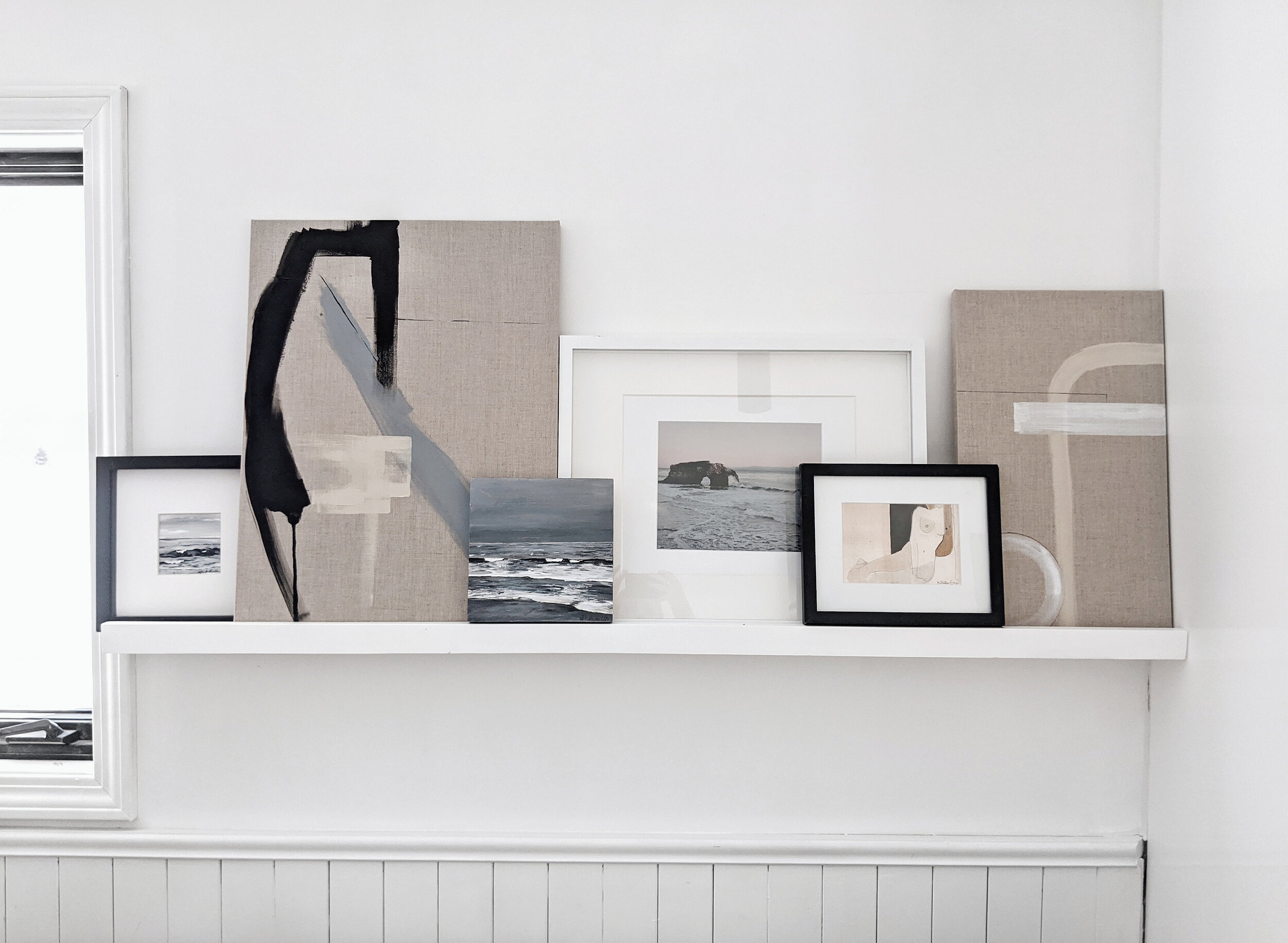
I get questions about this picture ledge on the daily. I’ve shared before, but the ledge itself is handmade in Halifax by a company called Power Designs. It’s perfect. We love how it fits perfectly above our couch in the kitchen and provides the perfect space to swap and display art. I am absolutely someone who can’t commit to artwork in one place permanently, SO this is a VERY helpful display and it’s so fun to rearrange. I get a lot of questions on how to style it so I’ve come up with a few tips.
Size variation
For the look that we like on the ledge in the kitchen I prefer a lot of size variation. I think they can look cool all the same size too, but for that look I think they need to be all very simple, and in the exact same frame. I like to play around with the different frames I have available for hanging and lay them out or put them up to get an idea of what should go where. Keeping taller works offset with smaller works will keep the eye balanced.
Different frames
I recommend playing with different frames and mixing frames with canvas. For this one I mixed black frames with white frames, wooden frames and canvas. I love the different textures this adds and makes it a lot more interesting to look at. Sometimes I swap in a few gold frames in the mix and this adds something special in the group and a little shine. Layering the frames a little bit allows you to fit more and also put smaller ones in front to balance them out.
Mixed medias
When staging I love mixing different types of artwork. In this case there is a great mixture of mixed media on canvas, acrylic on paper, art prints and photography prints. I love mixing photography with artwork because it adds even more dimension to the space. If you are new to collecting artwork I would recommending mixing original and prints! Once they are framed and staged in the right environment they look great. Once your collection gets going, you can rearrange accordingly.
My best advice is have fun with it! Take your time, and revisit it throughout your day. It’s okay to swap things out over time or move them around. The best thing about these are the layout isn’t permanent! Let me know if you try these at home! Tag me in your photos! @art.alliebeckwith
xx
Allie


